Credits to Maximillian Schwarzmüller. This lecture note are based on his Angular - The Complete Guide (2025 Edition).
1. Create Project
ng new vehicle-rental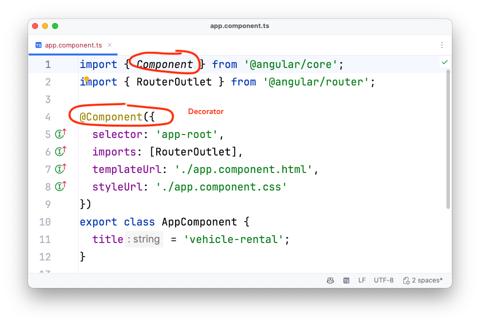
2. Add a Component Manually
<!doctype html>
<html lang="en">
<head>
  <meta charset="utf-8">
  <title>VehicleRental</title>
  <base href="/">
  <meta name="viewport" content="width=device-width, initial-scale=1">
  <link rel="icon" type="image/x-icon" href="favicon.ico">
</head>
<body>
  <app-header></app-header>
  <app-root></app-root>
</body>
</html>import { Component } from '@angular/core';
@Component({
selector: 'app-header', (1)
standalone: true, (2)
templateUrl: './header.component.html' (3)
})
export class HeaderComponent {
}| 1 | Der selector muss immer einen Bindestrich (Hyphen) beinhalten, damit es keine Überschneidungen mit derzeitigen oder zukünftigen HTML-Tags gibt. |
| 2 | ab Angular 19 ist der Default-Wert von standalone auf true gesetzt. |
| 3 | mit template kann direkt html-code verwendet werden, templateUrl verweist auf eine externe Datei. |
<header>
  <h1>EasyRent</h1>
</header>-
Beim Ausführen der Anwendung wird der Header nicht angezeigt, da die Komponente nicht in der
main.ts-Datei registriert ist. -
Man sieht in "Seitenquelltext anzeigen" den Header-Tag, er wird aber nicht gerendert.
-
In Angular wird die Anwendung durch das Bootstrapping gestartet.
import { bootstrapApplication } from '@angular/platform-browser';
import { appConfig } from './app/app.config';
import { AppComponent } from './app/app.component';
import { HeaderComponent } from './app/header.component';

bootstrapApplication(AppComponent, appConfig)
  .catch((err) => console.error(err));
bootstrapApplication(HeaderComponent);
-
JETZT SIEHT MAN DEN HEADER
| SO WIRD ES ABER NICHT GEMACHT! |
| Wir wollen die Komponenten hierarchisch aufbauen, daher soll der header in der app-component eingebunden werden. |

-
Die
AppComponentist die Wurzelkomponente und enthält alle anderen Komponenten. -
Man bootstrapped daher nur die
AppComponentin dermain.ts-Datei. -
One Angular Application = One Component Tree
import { bootstrapApplication } from '@angular/platform-browser';
import { appConfig } from './app/app.config';
import { AppComponent } from './app/app.component';

bootstrapApplication(AppComponent, appConfig)
.catch((err) => console.error(err));<app-header></app-header>
import { Component } from '@angular/core';
import {HeaderComponent} from './header.component';

@Component({
  selector: 'app-root',
  // standalone: true,  // ab Angular 19 default auf true
  imports: [HeaderComponent],
  templateUrl: './app.component.html',
  styleUrl: './app.component.css'
})
export class AppComponent {
  title = 'vehicle-rental';
}header {
display: flex;
flex-direction: column;
align-items: center;
gap: 1rem;
width: 90%;
max-width: 50rem;
margin: 0 auto 2rem auto;
text-align: center;
background: linear-gradient(
to bottom,
#2c0a4c,
#450d80
);
padding: 1rem;
border-bottom-right-radius: 12px;
border-bottom-left-radius: 12px;
box-shadow: 0 1px 8px rgba(0, 0, 0, 0.6);
}
img {
width: 3.5rem;
object-fit: contain;
}
h1 {
font-size: 1.25rem;
margin: 0;
padding: 0;
}
p {
margin: 0;
font-size: 0.8rem;
text-wrap: balance;
}
@media (min-width: 768px) {
header {
padding: 2rem;
}
img {
width: 4.5rem;
}
h1 {
font-size: 1.5rem;
margin: 0;
padding: 0;
}
}-
We also have to update the global styles in the
styles.cssfile.
/* You can add global styles to this file, and also import other style files */
* {
  box-sizing: border-box;
}

html {
  height: 100%;
}

body {
  font-family: "Poppins", sans-serif;
  background: radial-gradient(circle at top left, #181023, #0b0519);
  color: #c3b3d8;
  margin: 0;
  padding: 0;
  height: 100%;
}-
Copy the file
rent-a-car-logo-2.pnginto the public-folder -
You could also use a
src/assetsfolder, but for this example we use the public folder.Configuring the assets-folder
...
"assets": [
  "src/assets",
  {
    "glob": "**/*",
    "input": "public"
  }
],
...
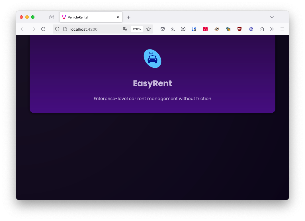
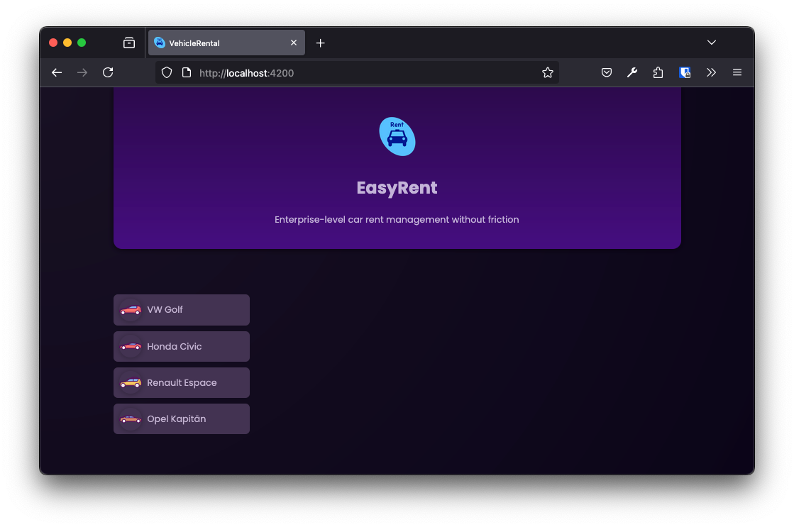
<header>
  <img src="rent-a-car-logo-3.png" alt="A vehicle rent list"/>
  <h1>EasyRent</h1>
  <p>Enterprise-level car rent management without friction</p>
</header><!doctype html>
<html lang="en">
<head>
<meta charset="utf-8">
<title>VehicleRental</title>
<base href="/">
<meta name="viewport" content="width=device-width, initial-scale=1">
<link rel="icon" type="image/x-icon" href="favicon.ico" />
<link rel="preconnect" href="https://fonts.googleapis.com" />
<link rel="preconnect" href="https://fonts.gstatic.com" crossorigin />
<link
href="https://fonts.googleapis.com/css2?family=Poppins:wght@400;700&display=swap"
rel="stylesheet"
/>
</head>
<body>
<app-root></app-root>
</body>
</html>
import { Component } from '@angular/core';

@Component({
  selector: 'app-header',
  standalone: true,
  templateUrl: './header.component.html',
  styleUrl: './header.component.css' (1)
})
export class HeaderComponent {
}| 1 | Das css-file muss noch referenziert werden. |
-
Now create a
header-Folder a refactor to move the header files into it.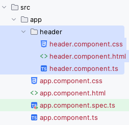
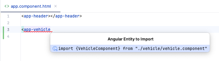
3. Generate a component
ng g c vehicle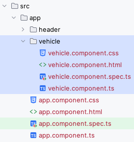
vehicle.component.css
div {
  border-radius: 6px;
  box-shadow: 0 1px 6px rgba(0, 0, 0, 0.1);
  overflow: hidden;
}

button {
  display: flex;
  align-items: center;
  gap: 0.5rem;
  padding: 0.35rem 0.5rem;
  background-color: #433352;
  color: #c3b3d1;
  border: none;
  font: inherit;
  cursor: pointer;
  width: 100%;
  min-width: 10rem;
  text-align: left;
}

button:hover,
button:active,
.active {
  background-color: #9965dd;
  color: #150722;
}

img {
  width: 2rem;
  object-fit: contain;
  border-radius: 50%;
  box-shadow: 0 1px 8px rgba(0, 0, 0, 0.3);
}

span {
  margin: 0;
  padding: 0;
  font-size: 0.8rem;
  font-weight: normal;
}<div>
<button>
<img src="" alt="">
<span>NAME</span>
</button>
</div>app.component.css
main {
  width: 90%;
  max-width: 50rem;
  margin: 2.5rem auto;
  display: grid;
  grid-auto-flow: row;
  gap: 2rem;
}

#vehicles {
  list-style: none;
  margin: 0;
  padding: 0;
  display: flex;
  gap: 0.5rem;
  overflow: auto;
}

#fallback {
  font-weight: bold;
  font-size: 1.15rem;
  margin: 0;
  text-align: center;
}

@media (min-width: 768px) {
  main {
    margin: 4rem auto;
    grid-template-columns: 1fr 3fr;
  }

  #vehicles {
    flex-direction: column;
  }

  #fallback {
    font-size: 1.5rem;
    text-align: left;
  }
}-
app.component.html
-
Strg+Space, Return
-
Return
-
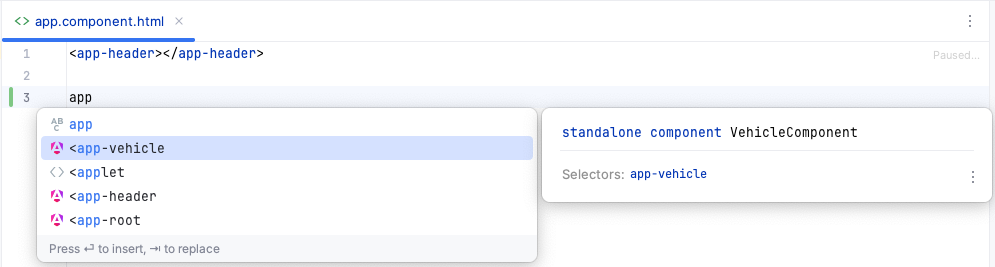
Nun ist auch die Vehicle-Komponente in der
app.component.tseingebunden.
<app-header />
<app-vehicle /><app-header />
<main>
<ul id="vehicles">
<li>
<app-vehicle/>
</li>
</ul>
</main>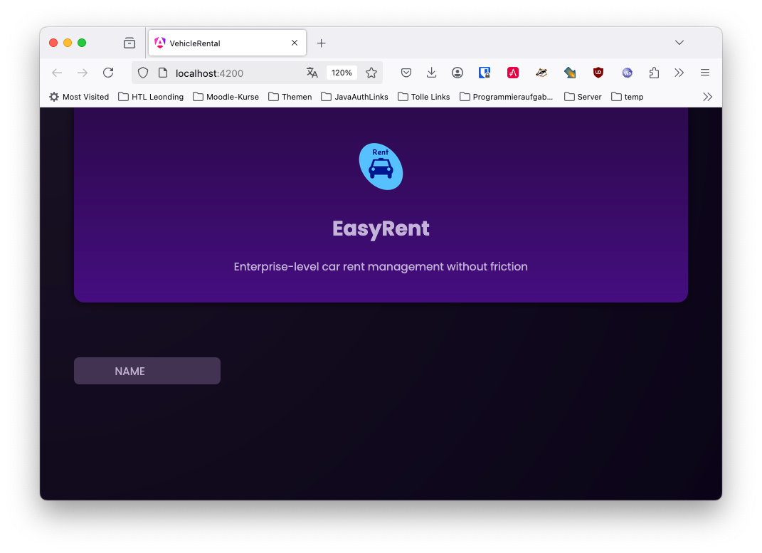
4. Output Dynamic Content
dummy-vehicles.ts
export const DUMMY_VEHICLES = [
  {
    id: 'v1',
    brand: 'VW Golf',
    avatar: 'compact.png'
  },
  {
    id: 'v2',
    brand: 'Honda Civic',
    avatar: 'coupe.png'
  },
  {
    id: 'v3',
    brand: 'Renault Espace',
    avatar: 'family.png'
  },
  {
    id: 'v4',
    brand: 'Opel Kapitän',
    avatar: 'limousine.png'
  },
  {
    id: 'v5',
    brand: 'Renault Clio',
    avatar: 'smallcar.png'
  },
  {
    id: 'v6',
    brand: 'Ford Mustang',
    avatar: 'sportscar.png'
  },
  {
    id: 'v7',
    brand: 'Dodge Warlock',
    avatar: 'truck.png'
  },
]import { Component } from '@angular/core';
import { DUMMY_VEHICLES } from '../dummy-vehicles';
const randomIndex = Math.floor(Math.random() * DUMMY_VEHICLES.length);
@Component({
selector: 'app-vehicle',
imports: [],
templateUrl: './vehicle.component.html',
styleUrl: './vehicle.component.css'
})
export class VehicleComponent {
selectedVehicle = DUMMY_VEHICLES[randomIndex];
}
Variablen mit Scope private sind nicht im html-File verfügbar.
|

4.1. String Interpolation
<div>
  <button>
    <img src="icons/"/>
    <span>{{ selectedVehicle.brand }}</span>
  </button>
</div>-
Sehen sie sich nun das Ergebnis an - Reloaden Sie die Seite.
4.2. Property Binding
<div>
  <button>
    <img
      [src]="'icons/' + selectedVehicle.avatar"
      [alt]="selectedVehicle.brand"
    />
    <span>{{ selectedVehicle.brand }}</span>
  </button>
</div>-
<img [src]="someSrc">bindet nicht das html-image tag sondern das darunterliegende HTMLImageElement DOM Objekt -
Dieser Artikel beschreibt den Unterschied zwischen Elementattributen und Properties
-
Sehen sie sich nun das Ergebnis an - Reloaden Sie die Seite.
4.3. Using Getters for Computed Values
<div>
  <button>
    <img
      [src]="imagePath"
      [alt]="selectedVehicle.brand"
    />
    <span>{{ selectedVehicle.brand }}</span>
  </button>
</div>// ommitted for brevity
@Component({
selector: 'app-vehicle',
imports: [],
templateUrl: './vehicle.component.html',
styleUrl: './vehicle.component.css'
})
export class VehicleComponent {
selectedVehicle = DUMMY_VEHICLES[randomIndex];
get imagePath() {
return 'icons/' + this.selectedVehicle.avatar;
}
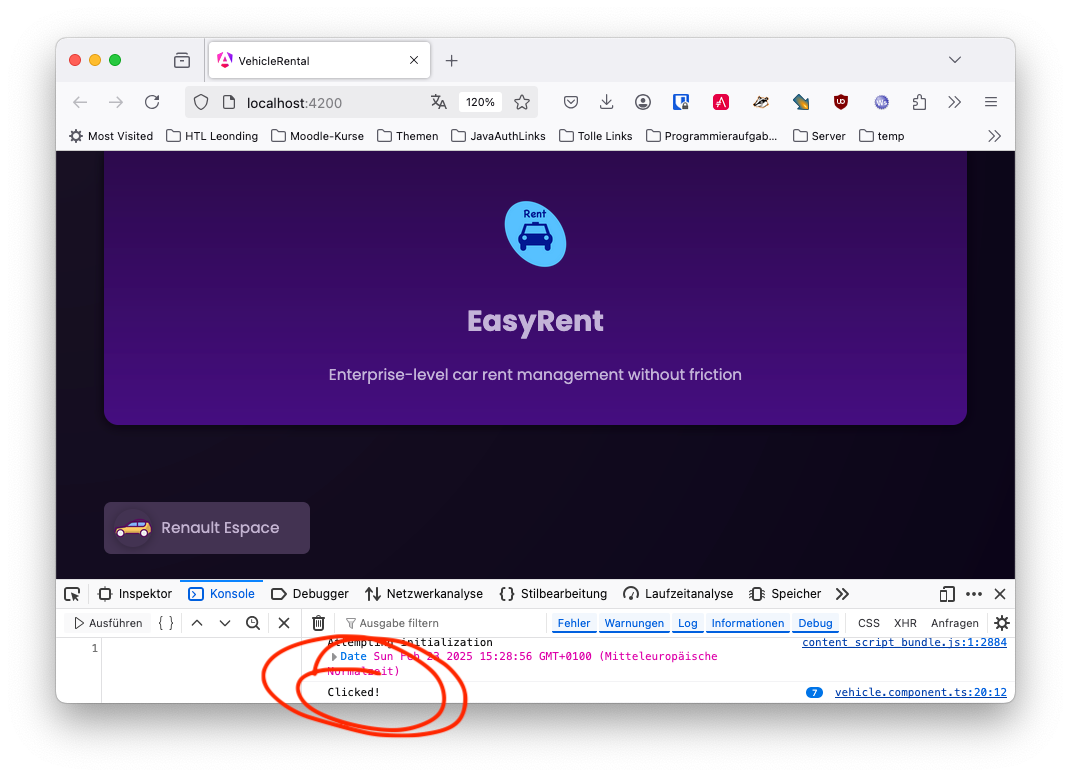
}4.4. Listening to Events With Event Binding
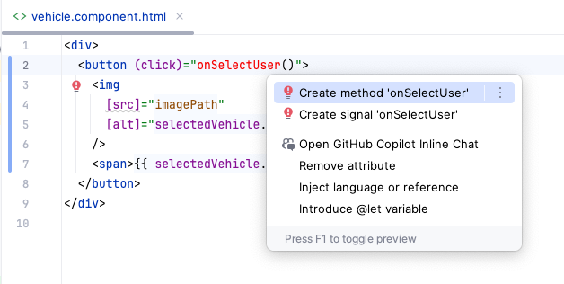
<div>
  <button (click)="onSelectVehicle()">
    <img
      [src]="imagePath"
      [alt]="selectedVehicle.brand"
    />
    <span>{{ selectedVehicle.brand }}</span>
  </button>
</div>// ommitted for brevity
@Component({
selector: 'app-vehicle',
imports: [],
templateUrl: './vehicle.component.html',
styleUrl: './vehicle.component.css'
})
export class VehicleComponent {
selectedVehicle = DUMMY_VEHICLES[randomIndex];
get imagePath() {
return 'icons/' + this.selectedVehicle.avatar;
}
onSelectVehicle() {
console.log('Clicked!');
}
}
4.5. Managing State & Changing Data
-
Now we want to change the UI using a button click — i.e. the state of the selected vehicle should change.
// ommitted for brevity

const randomIndex = Math.floor(Math.random() * DUMMY_VEHICLES.length);

@Component({
  selector: 'app-vehicle',
  imports: [],
  templateUrl: './vehicle.component.html',
  styleUrl: './vehicle.component.css'
})
export class VehicleComponent {
  selectedVehicle = DUMMY_VEHICLES[randomIndex];

  get imagePath() {
    return 'icons/' + this.selectedVehicle.avatar;
  }

  onSelectVehicle() {
    const randomIndex = Math.floor(Math.random() * DUMMY_VEHICLES.length);
    this.selectedVehicle = DUMMY_VEHICLES[randomIndex];
  }
}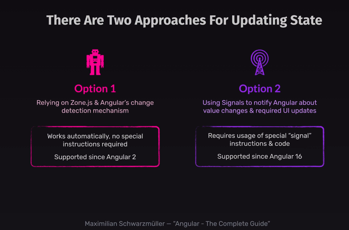
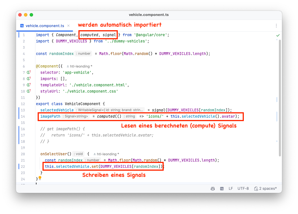
4.7. Introducing Signals
-
vehicle.component.ts
1
2
3
4
5
6
7
8
9
<div>
  <button (click)="onSelectVehicle()">
    <img
      [src]="imagePath()"  (1)
      [alt]="selectedVehicle().brand"   (1)
    />
    <span>{{ selectedVehicle().brand }}</span> (1)
  </button>
</div>
| 1 | Signals werden wie eine Methode mit runden Klammern angesprochen |
4.8. Defining Components Inputs
-
Now we will notice that component are not only used to divide the application into smaller parts, but also to use components multiple times.
 1
 2
 3
 4
 5
 6
 7
 8
 9
10
11
12
13
14
15
import { Component } from '@angular/core';


@Component({
  selector: 'app-vehicle',
  imports: [],
  templateUrl: './vehicle.component.html',
  styleUrl: './vehicle.component.css'
})
export class VehicleComponent {

  onSelectVehicle() {

  }
}
 1
 2
 3
 4
 5
 6
 7
 8
 9
10
11
12
13
14
import { Component } from '@angular/core';
import { HeaderComponent } from './header/header.component';
import { VehicleComponent } from './vehicle/vehicle.component';
import { DUMMY_VEHICLES } from './dummy-vehicles';

@Component({
  selector: 'app-root',
  imports: [HeaderComponent, VehicleComponent],
  templateUrl: './app.component.html',
  styleUrl: './app.component.css'
})
export class AppComponent {
  vehicles = DUMMY_VEHICLES
}
-
vehicle.component.ts
-
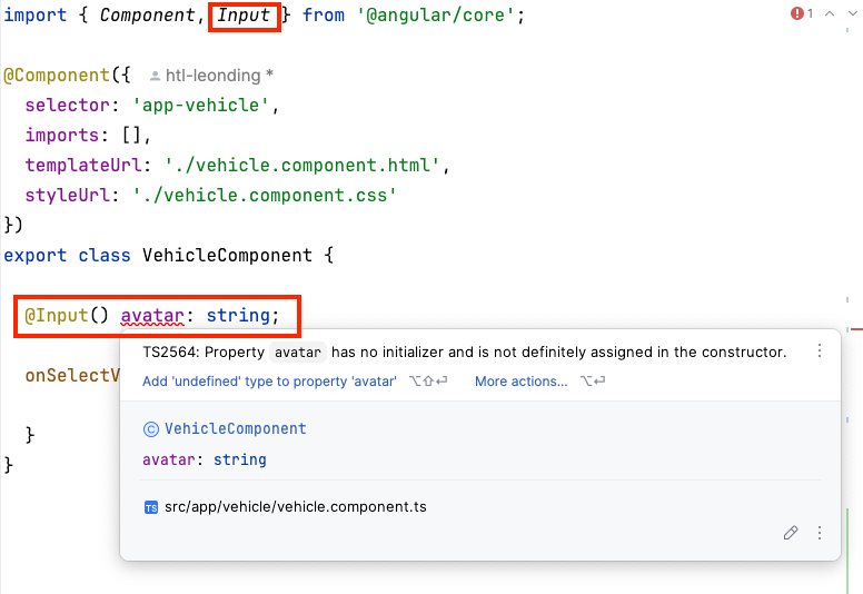
In TypeScript, the exclamation mark (
!) used in the context of@Input() avatar!: string; is called the definite assignment assertion. It tells the TypeScript compiler that you, as the developer, are certain that the avatar property will be assigned a value before it’s used, even though the compiler can’t statically prove it. -
Declaring inputs with the @Input decorator
We are using the @Inputdecorator to define the input properties of the component. Even this is deprecated, there are tons of projects using it, so it will not be removed in the near future.
 1
 2
 3
 4
 5
 6
 7
 8
 9
10
11
12
13
14
15
16
17
18
19
import { Component, Input } from '@angular/core';

@Component({
  selector: 'app-vehicle',
  imports: [],
  templateUrl: './vehicle.component.html',
  styleUrl: './vehicle.component.css'
})
export class VehicleComponent {

  @Input() avatar!: string;
  @Input() brand!: string;

  get imagePath() {
    return 'icons/' + this.avatar;
  }

  onSelectVehicle() {}
}
1
2
3
4
5
6
7
8
9
<div>
  <button (click)="onSelectVehicle()">
    <img
      [src]="imagePath"
      [alt]="brand"
    />
    <span>{{ brand }}</span>
  </button>
</div>
1
2
3
4
5
6
7
8
9
10
11
12
13
14
15
16
17
18
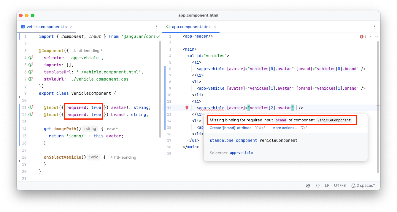
<app-header/>
<main>
<ul id="vehicles">
<li>
<app-vehicle [avatar]="vehicles[0].avatar" [brand]="vehicles[0].brand" />
</li>
<li>
<app-vehicle [avatar]="vehicles[1].avatar" [brand]="vehicles[1].brand" />
</li>
<li>
<app-vehicle [avatar]="vehicles[2].avatar" [brand]="vehicles[2].brand" />
</li>
<li>
<app-vehicle [avatar]="vehicles[3].avatar" [brand]="vehicles[3].brand" />
</li>
</ul>
</main>
4.10. Using Signal Inputs
-
input<T> is a generic type.
avatar = input(''); // mit Default-Wertavatar = input<string>(); // with generic typeavatar = input.required<string>(); // with required value 1
2
3
4
5
6
7
8
9
10
11
12
13
14
15
16
17
18
19
20
21
22
23
24
25
import { Component, Input, input, computed } from '@angular/core';
@Component({
selector: 'app-vehicle',
imports: [],
templateUrl: './vehicle.component.html',
styleUrl: './vehicle.component.css'
})
export class VehicleComponent {
// @Input({ required: true }) avatar!: string;
// @Input({ required: true }) brand!: string;
avatar = input.required<string>(); (1)
brand = input.required<string>(); (1)
// get imagePath() {
// return 'icons/' + this.avatar;
// }
imagePath = computed(() => 'icons/' + this.avatar() );
onSelectVehicle() {
}
}
| 1 | These inputs are read-only. You can’t change them from within the component. |
 1
 2
 3
 4
 5
 6
 7
 8
 9
10
11
12
13
14
15
16
17
18
<app-header/>

<main>
  <ul id="vehicles">
    <li>
      <app-vehicle [avatar]="vehicles[0].avatar" [brand]="vehicles[0].brand" />  (1)
    </li>
    <li>
      <app-vehicle [avatar]="vehicles[1].avatar" [brand]="vehicles[1].brand" /> (2)
    </li>
    <li>
      <app-vehicle [avatar]="vehicles[2].avatar" [brand]="vehicles[2].brand" /> (3)
    </li>
    <li>
      <app-vehicle [avatar]="vehicles[3].avatar" [brand]="vehicles[3].brand" /> (4)
    </li>
  </ul>
</main>
| 1 | From outside, the component is used as before, when no signal was used. You can still use property binding to pass data to the component. The value itself (vehicles[0].avatar) has not to be a signal.
But you also have to consider, that the value itself is no signal. It is the DUMMY_VEHICLES-array, which is a plain array and no signal. |
1
2
3
4
5
6
7
8
9
<div>
  <button (click)="onSelectVehicle()">
    <img
      [src]="imagePath()"
      [alt]="brand()"
    />
    <span>{{ brand() }}</span>
  </button>
</div>
-
But in the component itself, you have to deal with signals to access the values.
4.11. Custom Events with @Output
-
Initial State
 1
 2
 3
 4
 5
 6
 7
 8
 9
10
11
12
13
14
15
16
17
18
19
20
21
22
23
import { Component, computed, Input, input } from '@angular/core';

@Component({
  selector: 'app-vehicle',
  imports: [],
  templateUrl: './vehicle.component.html',
  styleUrl: './vehicle.component.css'
})
export class VehicleComponent {

  @Input({ required: true }) avatar!: string;
  @Input({ required: true }) brand!: string;
  // avatar = input.required<string>();
  // brand = input.required<string>();

  get imagePath() {
    return 'icons/' + this.avatar;
  }
  // imagePath = computed(() => 'icons/' + this.avatar() );

  onSelectVehicle() {
  }
}
1
2
3
4
5
6
7
8
9
<div>
  <button (click)="onSelectVehicle()">
    <img
      [src]="imagePath"
      [alt]="brand"
    />
    <span>{{ brand }}</span>
  </button>
</div>
-
Now we emit an event from the
VehicleComponentto theAppComponentwhen the button is clicked.
1
2
3
4
5
6
7
8
9
10
11
12
13
14
15
16
17
18
19
20
21
22
23
import { Component, EventEmitter, Input, Output } from '@angular/core';
@Component({
selector: 'app-vehicle',
imports: [],
templateUrl: './vehicle.component.html',
styleUrl: './vehicle.component.css'
})
export class VehicleComponent {
@Input({required:true}) id!: string
@Input({ required: true }) avatar!: string
@Input({ required: true }) brand!: string
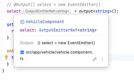
@Output() select = new EventEmitter() (1)
get imagePath() {
return 'icons/' + this.avatar;
}
onSelectVehicle() {
this.select.emit(this.id)
}
}
| 1 | The Event Emitter should be typed with the type of the emitted value, ie @Output() select = new EventEmitter<string>() |
1
2
3
4
5
6
7
8
9
10
11
12
13
14
15
16
17
18
19
20
21
22
23
24
25
26
27
28
29
30
31
32
33
34
35
36
<app-header/>
<main>
<ul id="vehicles">
<li>
<app-vehicle [id]="vehicles[0].id"
[avatar]="vehicles[0].avatar"
[brand]="vehicles[0].brand"
(select)="onSelectVehicle($event)"
/>
</li>
<li>
<app-vehicle [id]="vehicles[1].id"
[avatar]="vehicles[1].avatar"
[brand]="vehicles[1].brand"
(select)="onSelectVehicle($event)"
/>
</li>
<li>
<app-vehicle [id]="vehicles[2].id"
[avatar]="vehicles[2].avatar"
[brand]="vehicles[2].brand"
(select)="onSelectVehicle($event)"
/>
</li>
<li>
<app-vehicle [id]="vehicles[3].id"
[avatar]="vehicles[3].avatar"
[brand]="vehicles[3].brand"
(select)="onSelectVehicle($event)"
/>
</li>
</ul>
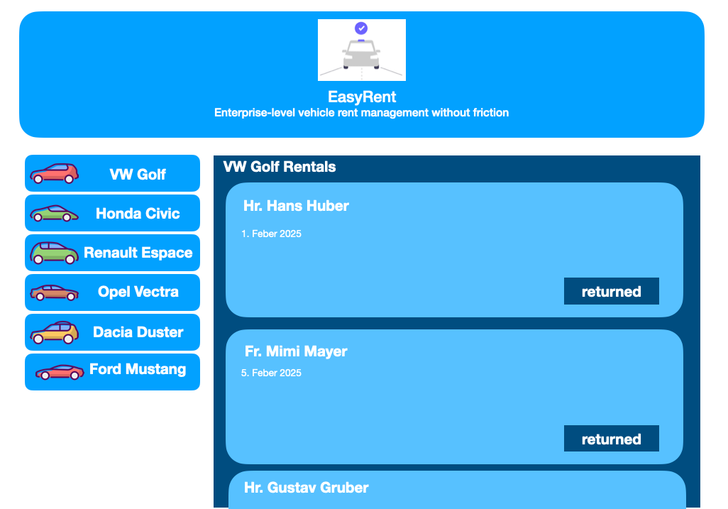
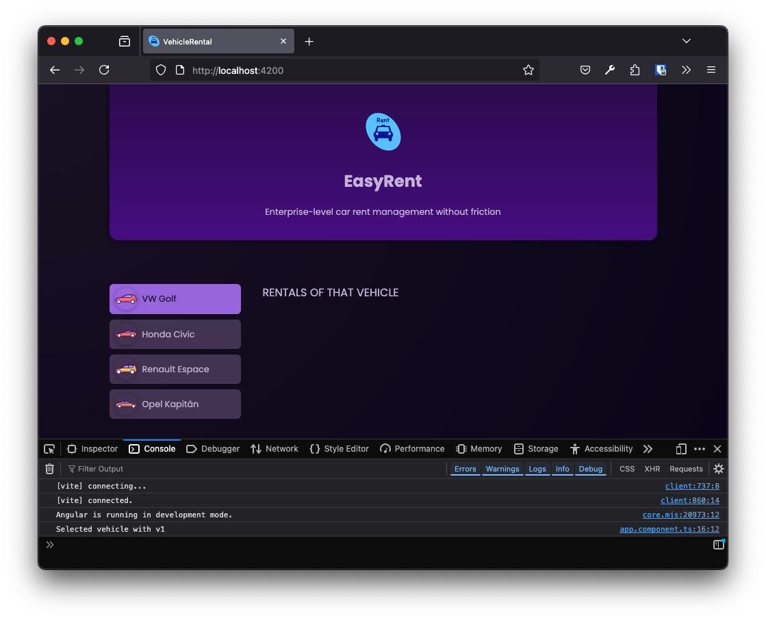
RENTALS OF THAT VEHICLE
</main>
-
the $event object will contain the
id, which was passed beionSelectVehicle()-method.
 1
 2
 3
 4
 5
 6
 7
 8
 9
10
11
12
13
14
15
16
17
18
import { Component } from '@angular/core';
import { HeaderComponent } from './header/header.component';
import { VehicleComponent } from './vehicle/vehicle.component';
import { DUMMY_VEHICLES } from './dummy-vehicles';

@Component({
  selector: 'app-root',
  imports: [HeaderComponent, VehicleComponent],
  templateUrl: './app.component.html',
  styleUrl: './app.component.css'
})
export class AppComponent {
  vehicles = DUMMY_VEHICLES

  onSelectVehicle(id: string) {
    console.log('Selected vehicle with ' + id);
  }
}
4.12. Custom events with output<…>()
 1
 2
 3
 4
 5
 6
 7
 8
 9
10
11
12
13
14
15
16
17
18
19
20
21
22
23
24
25
import { Component, EventEmitter, Input, output, Output } from '@angular/core';

@Component({
  selector: 'app-vehicle',
  imports: [],
  templateUrl: './vehicle.component.html',
  styleUrl: './vehicle.component.css'
})
export class VehicleComponent {

  @Input({required:true}) id!: string
  @Input({ required: true }) avatar!: string
  @Input({ required: true }) brand!: string
  // @Output() select = new EventEmitter()
  select = output<string>();
   (1) (2)

  get imagePath() {
    return 'icons/' + this.avatar;
  }

  onSelectVehicle() {
    this.select.emit(this.id)
  }
}
| 1 | The output()-function is a shorthand for creating an EventEmitter. |
| 2 | The generic type of the output()-function is the type of the emitted value (Rückgabewert).
|
4.13. Create a Configurable Component
-
Übung
-
Erstellen Sie eine neue Komponente
RentalsComponent, die den Markennamen des ausgewählten Fahrzeugs anzeigt. -
Binden Sie die neue Komponente in die
AppComponentein. -
Übergeben Sie den Markennamen des ausgewählten Fahrzeugs an die
RentalsComponent.
-
-
Lab
-
Create a new component
RentalsComponentthat displays the brand name of the selected vehicle. -
Integrate the new component into the
AppComponent. -
Pass the brand name of the selected vehicle to the
RentalsComponent.
-
-
Lösung / Solution
ng g c rentals --skip-tests<h2>{{ brand }}</h2> 1
2
3
4
5
6
7
8
9
10
11
12
13
import { Component, Input } from '@angular/core';
@Component({
selector: 'app-rentals',
imports: [],
templateUrl: './rentals.component.html',
styleUrl: './rentals.component.css'
})
export class RentalsComponent {
@Input({ required: true }) brand!: string
}
 1
 2
 3
 4
 5
 6
 7
 8
 9
10
11
12
13
14
15
16
17
18
19
20
21
22
23
24
25
26
27
28
29
30
31
import { Component } from '@angular/core';
import { HeaderComponent } from './header/header.component';
import { VehicleComponent } from './vehicle/vehicle.component';
import { DUMMY_VEHICLES } from './dummy-vehicles';
import { RentalsComponent } from './rentals/rentals.component';

@Component({
  selector: 'app-root',
  imports: [
    HeaderComponent,
    VehicleComponent,
    RentalsComponent
  ],
  templateUrl: './app.component.html',
  styleUrl: './app.component.css'
})
export class AppComponent {
  vehicles = DUMMY_VEHICLES
  selectedVehicleId = 'v1'

  get selectedVehicle() {
    return this.vehicles.find(
      (vehicle) => vehicle.id === this.selectedVehicleId
    )!  (1)
  }

  onSelectVehicle(id: string) {
    this.selectedVehicleId = id
  }

}
| 1 | The ! operator is used to tell TypeScript that the value will never be null or undefined. |
 1
 2
 3
 4
 5
 6
 7
 8
 9
10
11
12
13
14
15
16
17
18
19
20
21
22
23
24
25
26
27
28
29
30
31
32
33
34
35
36
37
<app-header/>

<main>
  <ul id="vehicles">
    <li>
      <app-vehicle [id]="vehicles[0].id"
                   [avatar]="vehicles[0].avatar"
                   [brand]="vehicles[0].brand"
                   (select)="onSelectVehicle($event)"
      />
    </li>
    <li>
      <app-vehicle [id]="vehicles[1].id"
                   [avatar]="vehicles[1].avatar"
                   [brand]="vehicles[1].brand"
                   (select)="onSelectVehicle($event)"
      />
    </li>
    <li>
      <app-vehicle [id]="vehicles[2].id"
                   [avatar]="vehicles[2].avatar"
                   [brand]="vehicles[2].brand"
                   (select)="onSelectVehicle($event)"
      />
    </li>
    <li>
      <app-vehicle [id]="vehicles[3].id"
                   [avatar]="vehicles[3].avatar"
                   [brand]="vehicles[3].brand"
                   (select)="onSelectVehicle($event)"
      />
    </li>
  </ul>

  <app-rentals [brand]="selectedVehicle.brand" />

</main>
Don’t forget to import RentalsComponent in the app.component.ts file.
|
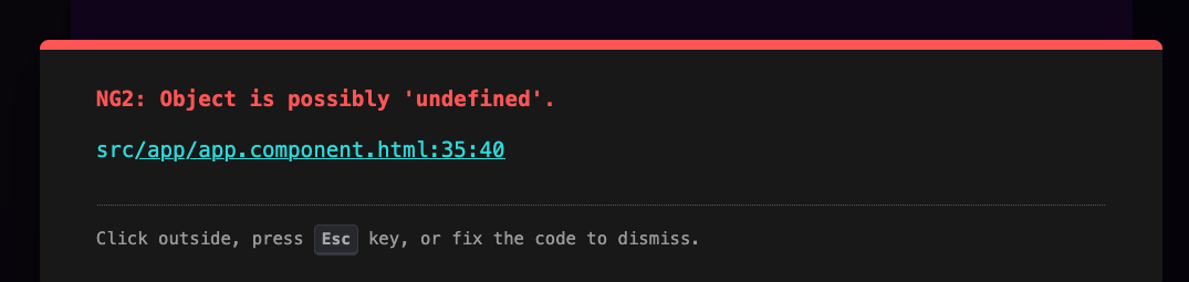
4.14. Potentially Undefined Values and Union Types
-
Without the
!operator, TypeScript would throw an error because thefind()method could returnundefined. -
The
!operator is a way to tell TypeScript that the value will never benullorundefined. But it is not a good practice to use it in this way, because it is only a promise to TypeScript, but not a guarantee. -
A ?-operator tells TypeScript that the value could be
nullorundefined. -
The
selectedVehicleproperty could benullorundefinedif thefind()method does not find a vehicle with the given id.
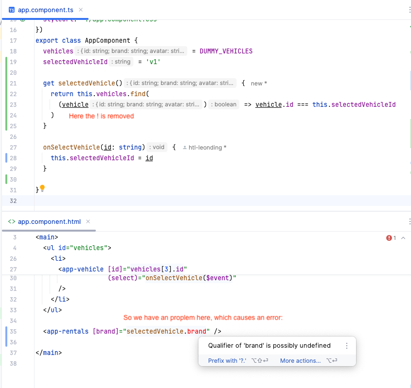
-
The usage of
?is not helpful in this case.
-
Alternativen:
@Input() brand: string | undefined-
The
undefinedtype (the pipe symbol) is a union type, which means that the value could be a string orundefined.
@Input() brand?: string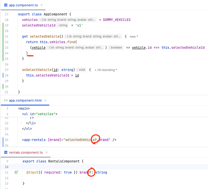
4.15. Accepting Objects as Inputs
// ...
export class VehicleComponent {

  @Input({required:true}) id!: string
  @Input({ required: true }) avatar!: string
  @Input({ required: true }) brand!: string

  select = output<string>();

  get imagePath() {
    return 'icons/' + this.avatar;
  }

  onSelectVehicle() {
    this.select.emit(this.id)
  }

  // ...
}// ...
export class VehicleComponent {
@Input({required: true}) vehicle!: { (1)
id: string
avatar: string
name: string
}
// @Output() select = new EventEmitter()
select = output<string>();
get imagePath() {
return 'icons/' + this.vehicle.avatar; (2)
}
onSelectVehicle() {
this.select.emit(this.vehicle.id) (3)
}
}| 1 | define the object-type |
| 2 | access the object properties |
| 3 | access the object properties once more |
<div>
  <button (click)="onSelectVehicle()">
    <img
      [src]="imagePath"
      [alt]="vehicle.brand"  (1)
    />
    <span>{{ vehicle.brand }}</span> (2)
  </button>
</div><app-header/>
<main>
<ul id="vehicles">
<li>
<app-vehicle [vehicle]="vehicles[0]" (select)="onSelectVehicle($event)" />
</li>
<li>
<app-vehicle [vehicle]="vehicles[1]" (select)="onSelectVehicle($event)" />
</li>
<li>
<app-vehicle [vehicle]="vehicles[2]" (select)="onSelectVehicle($event)" />
</li>
<li>
<app-vehicle [vehicle]="vehicles[3]" (select)="onSelectVehicle($event)" />
</li>
</ul>
<app-rentals [brand]="selectedVehicle ? selectedVehicle.brand : ''"/>
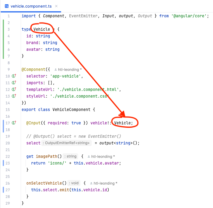
</main>4.16. TypeScript: Type Aliases and Interfaces
4.16.1. Object Type
// ...

 type Vehicle = {
   id: string
   brand: string
   avatar: string
 }

export class VehicleComponent {

  @Input({required: true}) vehicle!: Vehicle

  select = output<string>();

  get imagePath() {
    return 'icons/' + this.vehicle.avatar; (1)
  }

  onSelectVehicle() {
    this.select.emit(this.vehicle.id) (2)
  }
}
-
An alternative to the object type is the interface
-
In angular the interface is used more often than the object type (but it is a matter of taste)
-
According to ChatGPT: In Angular (and TypeScript in general), developers often prefer interfaces over object types (classes) for several reasons:
-
Type Safety Without Runtime Overhead
-
Interfaces are purely a TypeScript construct and do not exist in JavaScript at runtime. This means they do not add extra code to the final JavaScript output, making the application more lightweight.
-
Classes, on the other hand, remain in the compiled JavaScript, potentially increasing the bundle size.
-
-
Structural Typing (Duck Typing)
-
TypeScript uses structural typing, meaning two objects are considered the same type if they have the same shape. This makes interfaces more flexible compared to classes.
interface User {
  id: number;
  name: string;
}

function printUser(user: User) {
  console.log(user.name);
}

const person = { id: 1, name: "Alice", age: 25 };
printUser(person); // ✅ Works, extra properties are ignored
-
-
Better Readability and Simplicity
-
Interfaces are simple and easy to understand, especially for defining data structures (DTOs, API responses, form models, etc.).
-
-
4.16.2. Interface
// ...

 interface Vehicle {
   id: string
   brand: string
   avatar: string
 }

export class VehicleComponent {

  @Input({required: true}) vehicle!: Vehicle

  select = output<string>();

  get imagePath() {
    return 'icons/' + this.vehicle.avatar; (1)
  }

  onSelectVehicle() {
    this.select.emit(this.vehicle.id) (2)
  }
}
4.17. Dynamic Output of List Content
<app-header/>

<main>
  <ul id="vehicles">
    @for (vehicle of vehicles; track vehicle.id) { (1)

      <li>
        <app-vehicle [vehicle]="vehicle"
                     (select)="onSelectVehicle($event)"/>
      </li>
    }
  </ul>

  <app-rentals [brand]="selectedVehicle ? selectedVehicle.brand : ''"/>

</main>
<.> <.> when the list changes, track is used to keep the state of the list items. So the DOM is not completely re-rendered.
4.18. Outputting Conditional Content
-
The
RentalsComponentshould only be displayed when a vehicle is selected.
export class AppComponent {
  vehicles = DUMMY_VEHICLES
  selectedVehicleId?: string  (1)

  // ...
}| 1 | We remove the initial value of the selectedVehicleId property to make it undefined.
|
<app-header/>

<main>
  <ul id="vehicles">
    // ...
  </ul>

  @if (selectedVehicle) {
    <app-rentals [brand]="selectedVehicle.brand"/>  (1)
  } @else {  (2)
    <p id="fallback">Select a vehicle to see its rentals!</p>
  }

</main>| 1 | Now we can remove the ternary operator because the selectedVehicle property is always defined when the RentalsComponent is rendered. |
| 2 | The @else directive is used to render a fallback message when no vehicle is selected.
|
4.19. Legacy Angular Directives ngFor anf ngIf
-
These are structural directives.
 1
 2
 3
 4
 5
 6
 7
 8
 9
10
11
12
13
14
15
16
17
18
19
20
21
22
23
24
25
<app-header/>

<main>
  <ul id="vehicles">
    <!--    @for (vehicle of vehicles; track vehicle.id) {-->

    <li *ngFor="let vehicle of vehicles">
      <app-vehicle [vehicle]="vehicle"
                   (select)="onSelectVehicle($event)"/>
    </li>
    <!--    }-->
  </ul>

  <!--  @if (selectedVehicle) {-->
  <!--    <app-rentals [brand]="selectedVehicle ? selectedVehicle.brand : ''"/>-->
  <app-rentals *ngIf="selectedVehicle; else fallback"
               [brand]="selectedVehicle!.brand"/>
  <!--  } @else {-->
  <ng-template #fallback>
    <p id="fallback">Select a vehicle to see its rentals!</p>
  </ng-template>

  <!--  }-->

</main>
-
and
ngFor' and `ngIfhas to be unlocked in the app.component.ts file.
import { Component } from '@angular/core';
import { HeaderComponent } from './header/header.component';
import { VehicleComponent } from './vehicle/vehicle.component';
import { DUMMY_VEHICLES } from './dummy-vehicles';
import { RentalsComponent } from './rentals/rentals.component';
import { NgFor, NgIf } from '@angular/common';

@Component({
  selector: 'app-root',
  imports: [
    HeaderComponent,
    VehicleComponent,
    RentalsComponent,
    NgFor,
    NgIf
  ],
  templateUrl: './app.component.html',
  styleUrl: './app.component.css'
})
export class AppComponent {
  vehicles = DUMMY_VEHICLES
  selectedVehicleId?: string

  get selectedVehicle() {
    return this.vehicles.find(
      (vehicle) => vehicle.id === this.selectedVehicleId
    )
  }

  onSelectVehicle(id: string) {
    this.selectedVehicleId = id
  }

}-
But we are using modern angular-versions, so we will use the new directives.
4.20. More Components
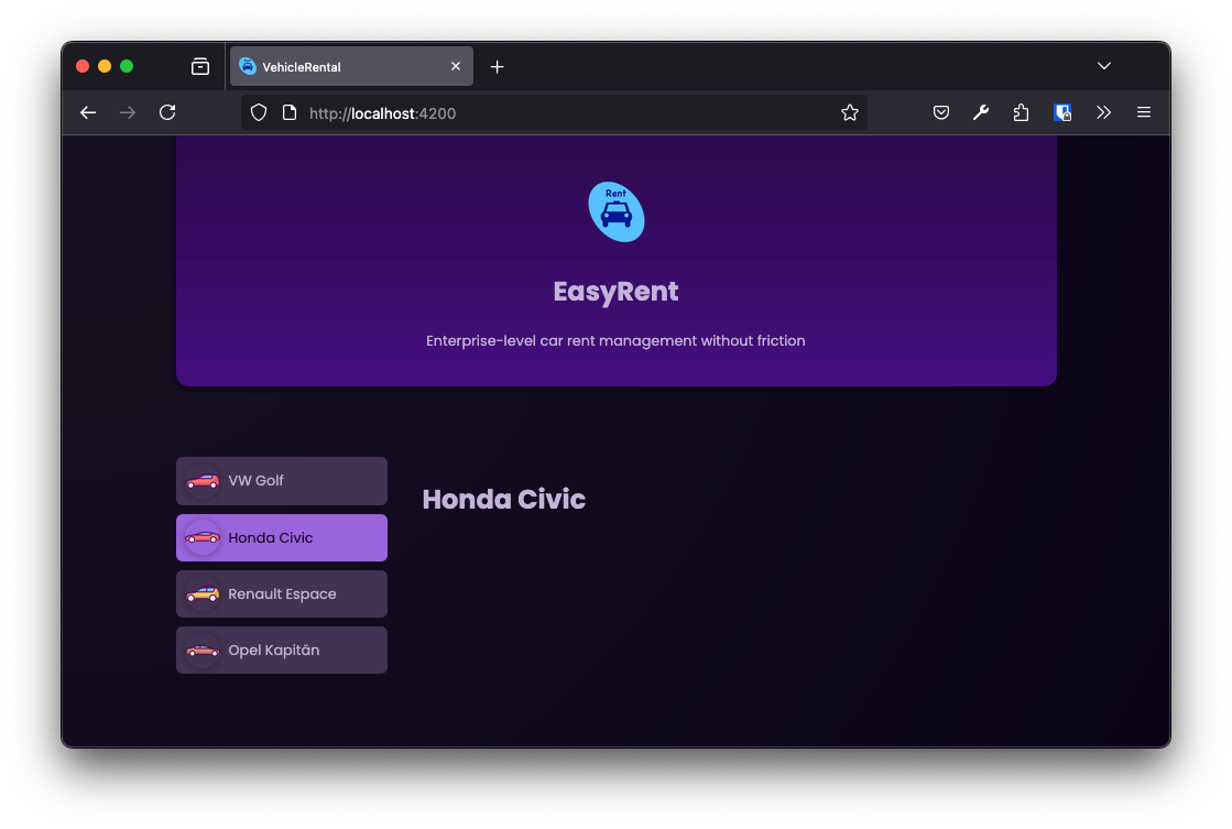
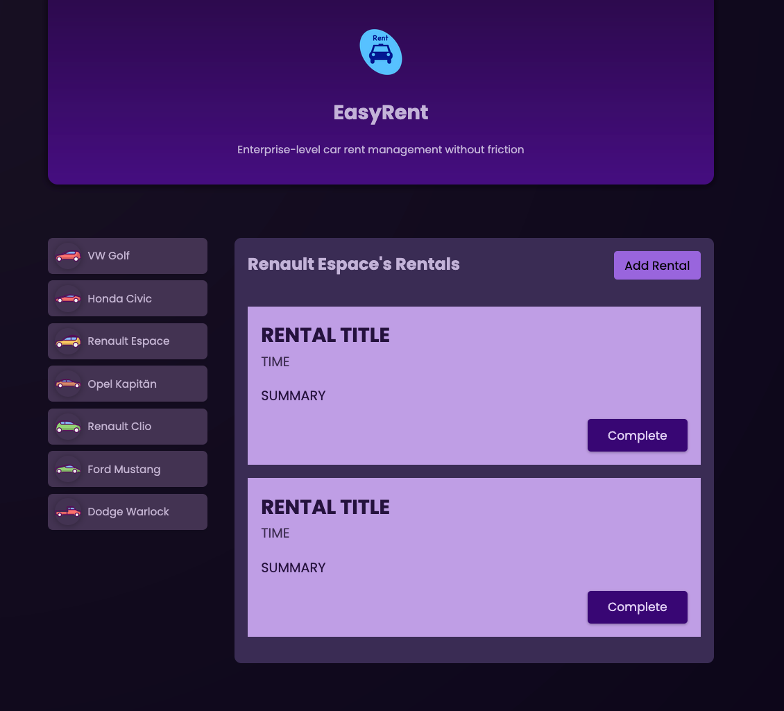
<section id="rentals">
  <header>
    <h2>{{ brand }}'s Rentals</h2>
    <menu>
      <button>Add Rental</button>
    </menu>
  </header>

  <ul>
    <li>

    </li>
  </ul>
</section>-
With this css the rentals-section is displayed in a nice way.
rentals.component.css
#rentals {
  padding: 1rem;
  border-radius: 8px;
  max-height: 60vh;
  overflow: auto;
  background-color: #3a2c54;
}

header {
  display: flex;
  justify-content: space-between;
  align-items: flex-start;
  margin-bottom: 2rem;
  gap: 1rem;
}

h2 {
  margin: 0;
  font-size: 0.9rem;
  width: 60%;
  text-wrap: balance;
}

menu {
  margin: 0;
  padding: 0;
}

menu button {
  font: inherit;
  cursor: pointer;
  background-color: #9965dd;
  border-radius: 4px;
  border: none;
  padding: 0.35rem 0.8rem;
  font-size: 0.9rem;
}

menu button:hover,
menu button:active {
  background-color: #a565dd
}

ul {
  list-style: none;
  margin: 1rem 0;
  padding: 0;
  display: flex;
  flex-direction: column;
  gap: 1rem;
  max-height: 50vh;
  overflow: auto;
}

@media (min-width: 768px) {
  h2 {
    font-size: 1.25rem;
  }

  menu {
    width: auto;
  }
}-
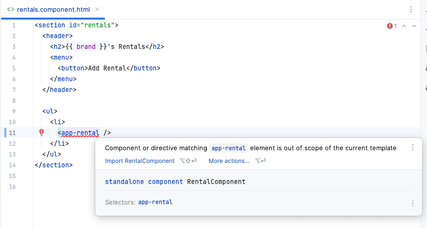
For the rentals we need a new component.
ng g c rentals/rental --skip-tests
import { Component, Input } from '@angular/core';
import { RentalComponent } from './rental/rental.component';

@Component({
  selector: 'app-rentals',
  imports: [
    RentalComponent
  ],
  templateUrl: './rentals.component.html',
  styleUrl: './rentals.component.css'
})
export class RentalsComponent {

  @Input({ required: true }) brand?: string

}<section id="rentals">
<header>
<h2>{{ brand }}'s Rentals</h2>
<menu>
<button>Add Rental</button>
</menu>
</header>
<ul>
<li>
<app-rental />
</li>
<li>
<app-rental />
</li>
<li>
<app-rental />
</li>
</ul>
</section>-
Add the stye-sheet to the rental component.
rental.component.css
article {
  padding: 1rem;
  color: #25113d;
  background-color: #bf9ee5;
}

h2 {
  margin: 0;
}

time {
  color: #3c2c50;
}

.actions {
  text-align: right;
  margin: 0;
}

.actions button {
  font: inherit;
  font-size: 0.9rem;
  cursor: pointer;
  background-color: #380774;
  color: #decdf2;
  border-radius: 4px;
  padding: 0.5rem 1.5rem;
  border: none;
  box-shadow: 0 1px 3px rgba(0, 0, 0, 0.3);
  transition: all 0.3s ease;
}

.actions button:hover,
.actions button:active {
  background-color: #4a0774;
  box-shadow: 0 1px 6px rgba(0, 0, 0, 0.3);
}
4.21. Outputting Vehicle-specific Rentals
-
Now we create some rentals for the vehicles.
 1
 2
 3
 4
 5
 6
 7
 8
 9
10
11
12
13
14
15
16
17
18
19
20
21
22
23
24
25
26
27
28
29
30
31
32
33
34
35
36
37
38
import { Component, Input } from '@angular/core';
import { RentalComponent } from './rental/rental.component';

@Component({
  selector: 'app-rentals',
  imports: [
    RentalComponent
  ],
  templateUrl: './rentals.component.html',
  styleUrl: './rentals.component.css'
})
export class RentalsComponent {
  @Input() brand?: string

  rentals = [
    {
      id: 'r1',
      vehicleId: 'v1',
      title: 'Susi rented a car',
      summary: 'Susi rented a car for going to the beach',
      dueDate: '2025-04-01'
    },
    {
      id: 'r2',
      vehicleId: 'v3',
      title: 'Hansi rented a car',
      summary: 'Hansi rented a car for going to the mountains',
      dueDate: '2025-04-03'
    },
    {
      id: 'r3',
      vehicleId: 'v3',
      title: 'Berta rented a car',
      summary: 'Berta rented also a car for going to the mountains',
      dueDate: '2025-04-07'
    },
  ];
}
<section id="rentals">
  <header>
    <h2>{{ brand }}'s Rentals</h2>
    <menu>
      <button>Add Rental</button>
    </menu>
  </header>

  <ul>
    @for (rental of rentals; track rental.id) {
      <li>
        <app-rental/>
      </li>
    }
  </ul>
</section>-
This doesn’t change the output, because the rentals are still hard-coded.
-
Now we add a filter to the rentals.
 1
 2
 3
 4
 5
 6
 7
 8
 9
10
11
12
13
14
15
16
17
18
19
20
21
22
23
24
25
26
27
28
29
30
31
32
33
34
35
36
37
38
39
40
41
42
43
import { Component, Input } from '@angular/core';
import { RentalComponent } from './rental/rental.component';

@Component({
  selector: 'app-rentals',
  imports: [
    RentalComponent
  ],
  templateUrl: './rentals.component.html',
  styleUrl: './rentals.component.css'
})
export class RentalsComponent {
  @Input({ required: true }) vehicleId!: string
  @Input({ required: true }) brand!: string

  rentals = [
    {
      id: 'r1',
      vehicleId: 'v1',
      title: 'Susi rented a car',
      summary: 'Susi rented a car for going to the beach',
      dueDate: '2025-04-01'
    },
    {
      id: 'r2',
      vehicleId: 'v3',
      title: 'Hansi rented a car',
      summary: 'Hansi rented a car for going to the mountains',
      dueDate: '2025-04-03'
    },
    {
      id: 'r3',
      vehicleId: 'v3',
      title: 'Berta rented a car',
      summary: 'Berta rented also a car for going to the mountains',
      dueDate: '2025-04-07'
    },
  ];

  get selectedVehicleRentals() {
    return this.rentals.filter((rental) => rental.vehicleId === this.vehicleId);
  }
}
 1
 2
 3
 4
 5
 6
 7
 8
 9
10
11
12
13
14
15
16
17
18
19
20
<app-header/>

<main>
  <ul id="vehicles">
    @for (vehicle of vehicles; track vehicle.id) {

      <li>
        <app-vehicle [vehicle]="vehicle"
                     (select)="onSelectVehicle($event)"/>
      </li>
    }
  </ul>

  @if (selectedVehicle) {
    <app-rentals [vehicleId]="selectedVehicle.id" [brand]="selectedVehicle.brand"/>
  } @else {
    <p id="fallback">Select a vehicle to see its rentals!</p>
  }

</main>
4.22. Outputting Rental Data in the Rental Component
 1
 2
 3
 4
 5
 6
 7
 8
 9
10
11
12
13
14
15
16
17
18
19
20
21
22
import { Component, Input } from '@angular/core';

interface Rental {
  id: string
  vehicleId: string
  title: string
  summary: string
  dueDate: string
}


@Component({
  selector: 'app-rental',
  imports: [],
  templateUrl: './rental.component.html',
  styleUrl: './rental.component.css'
})
export class RentalComponent {

  @Input({ required: true }) rental!: Rental

}
-
First we have to declare the rental interface.
-
Then we can use the rental interface in the
RentalComponentto define the input property.
1
2
3
4
5
6
7
8
9
10
11
12
13
14
15
16
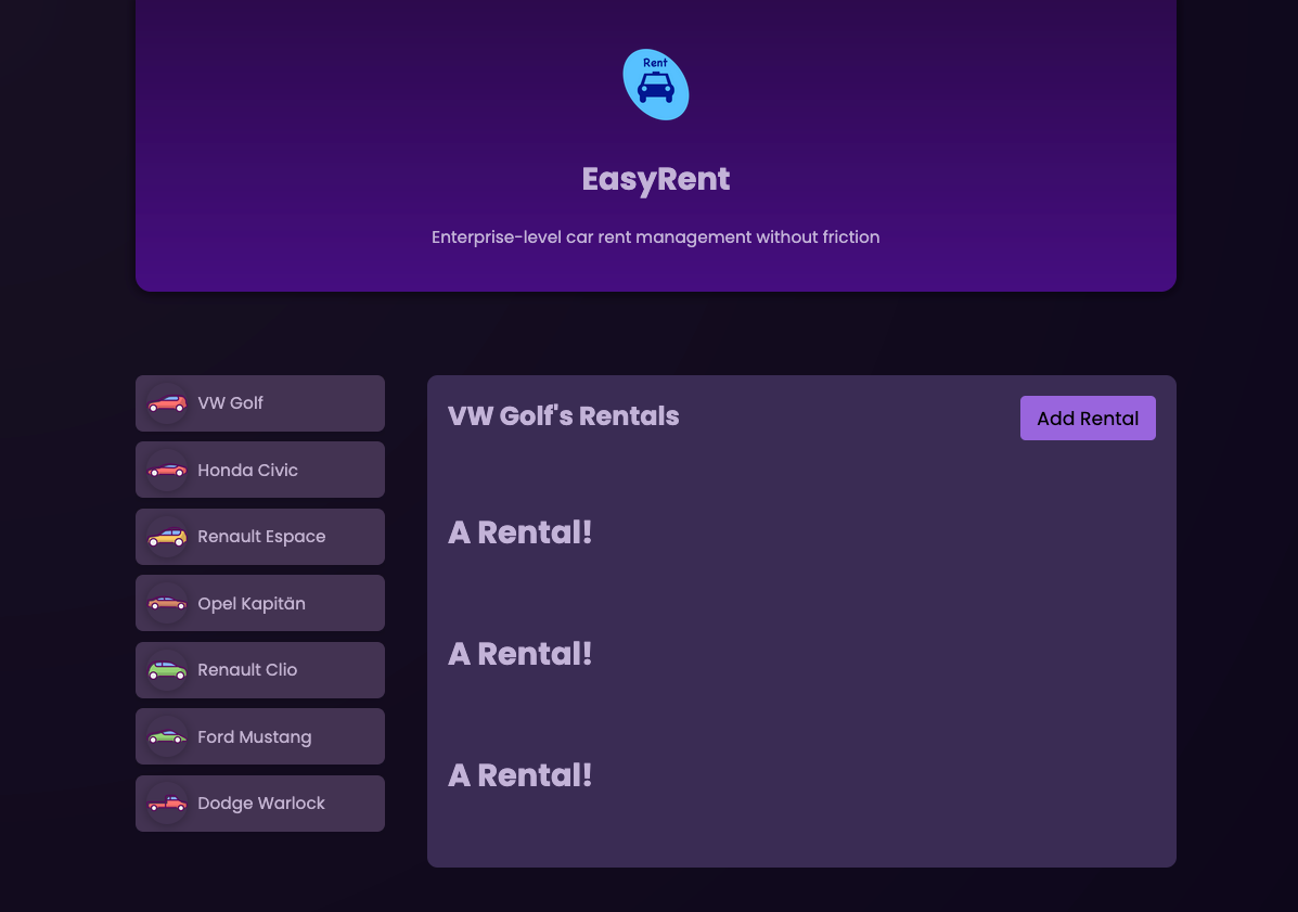
<section id="rentals">
<header>
<h2>{{ brand }}'s Rentals</h2>
<menu>
<button>Add Rental</button>
</menu>
</header>
<ul>
@for (rental of selectedVehicleRentals; track rental.id) {
<li>
<app-rental [rental]="rental" /> (1)
</li>
}
</ul>
</section>
| 1 | Now we bind the rental object to the rental component. |
<article>
  <h2>{{rental.title}}</h2>
  <time>{{rental.dueDate}}</time>
  <p>{{rental.summary}}</p>
  <p class="actions">
    <button>Complete</button>
  </p>
</article>
4.23. Storing Data Models in Separate Files
-
create a new file:
vehicle.model.tsin thevehicle-folder
import { Component, EventEmitter, Input, output, Output } from '@angular/core';

// remove the interface from the component

@Component({
  selector: 'app-vehicle',
  imports: [],
  templateUrl: './vehicle.component.html',
  styleUrl: './vehicle.component.css'
})
export class VehicleComponent {

  // ommitted for brevity

}export interface Vehicle {
id: string
brand: string
avatar: string
}-
you have to export the interface, so it can be used in other files.
-
Now we can import the interface in the
vehicle.component.tsfile.
import { Component, EventEmitter, Input, output, Output } from '@angular/core';
import type { Vehicle } from './vehicle.model';

// remove the interface from the component

@Component({
  selector: 'app-vehicle',
  imports: [],
  templateUrl: './vehicle.component.html',
  styleUrl: './vehicle.component.css'
})
export class VehicleComponent {

    @Input({ required: true }) vehicle!: Vehicle;
    // ommitted for brevity

}-
Now we do the same for the rental component.
import { Component, Input } from '@angular/core';
import type { Rental } from './rental.model';  (1)

// remove the rental-interface from the component

@Component({
  selector: 'app-rental',
  imports: [],
  templateUrl: './rental.component.html',
  styleUrl: './rental.component.css'
})
export class RentalComponent {

  @Input({ required: true }) rental!: Rental

}-
After inserting the interface in rental.model.ts, this import will be inserted automatically.
-
you can add the type-keyword to make clear it is a type-import.
-
import typeonly imports declarations to be used for type annotations and declarations. It always gets fully erased, so there’s no remnant of it at runtime. So, sometimes you can avoid odd errors when usingimport type.
-
export interface Rental {
  id: string
  vehicleId: string
  title: string
  summary: string
  dueDate: string
}
4.24. Dynamic CSS Styling with Class Bindings
-
Now we want to highlight the selected vehicle in the list of vehicles-buttons.
-
In the vehicle.component.css is already a class called
.active, which we can use to highlight the selected vehicle.
...
button:hover,
button:active,
.active {
  background-color: #9965dd;
  color: #150722;
}
...-
We know already which vehicle is selected, because we have the
selectedVehicleIdproperty in theAppComponent.
<app-header/>

<main>
  <ul id="vehicles">
    @for (vehicle of vehicles; track vehicle.id) {

      <li>
        <app-vehicle [selected]="vehicle.id === selectedVehicleId"
                     [vehicle]="vehicle"
                     (select)="onSelectVehicle($event)"/>
      </li>
    }
  </ul>

  @if (selectedVehicle) {
    <app-rentals [vehicleId]="selectedVehicle.id"
                 [brand]="selectedVehicle.brand"/>
  } @else {
    <p id="fallback">Select a vehicle to see its rentals!</p>
  }

</main>
import { Component, EventEmitter, Input, output, Output } from '@angular/core';
import type { Vehicle } from './vehicle.model';
@Component({
selector: 'app-vehicle',
imports: [],
templateUrl: './vehicle.component.html',
styleUrl: './vehicle.component.css'
})
export class VehicleComponent {
@Input({ required: true }) vehicle!: Vehicle;
@Input({ required: true }) selected!: boolean;
// @Output() select = new EventEmitter()
select = output<string>();
get imagePath() {
return 'icons/' + this.vehicle.avatar;
}
onSelectVehicle() {
this.select.emit(this.vehicle.id)
}
}<div>
<button [class.active]="selected"
(click)="onSelectVehicle()">
<img
[src]="imagePath"
[alt]="vehicle.brand"
/>
<span>{{ vehicle.brand }}</span>
</button>
</div>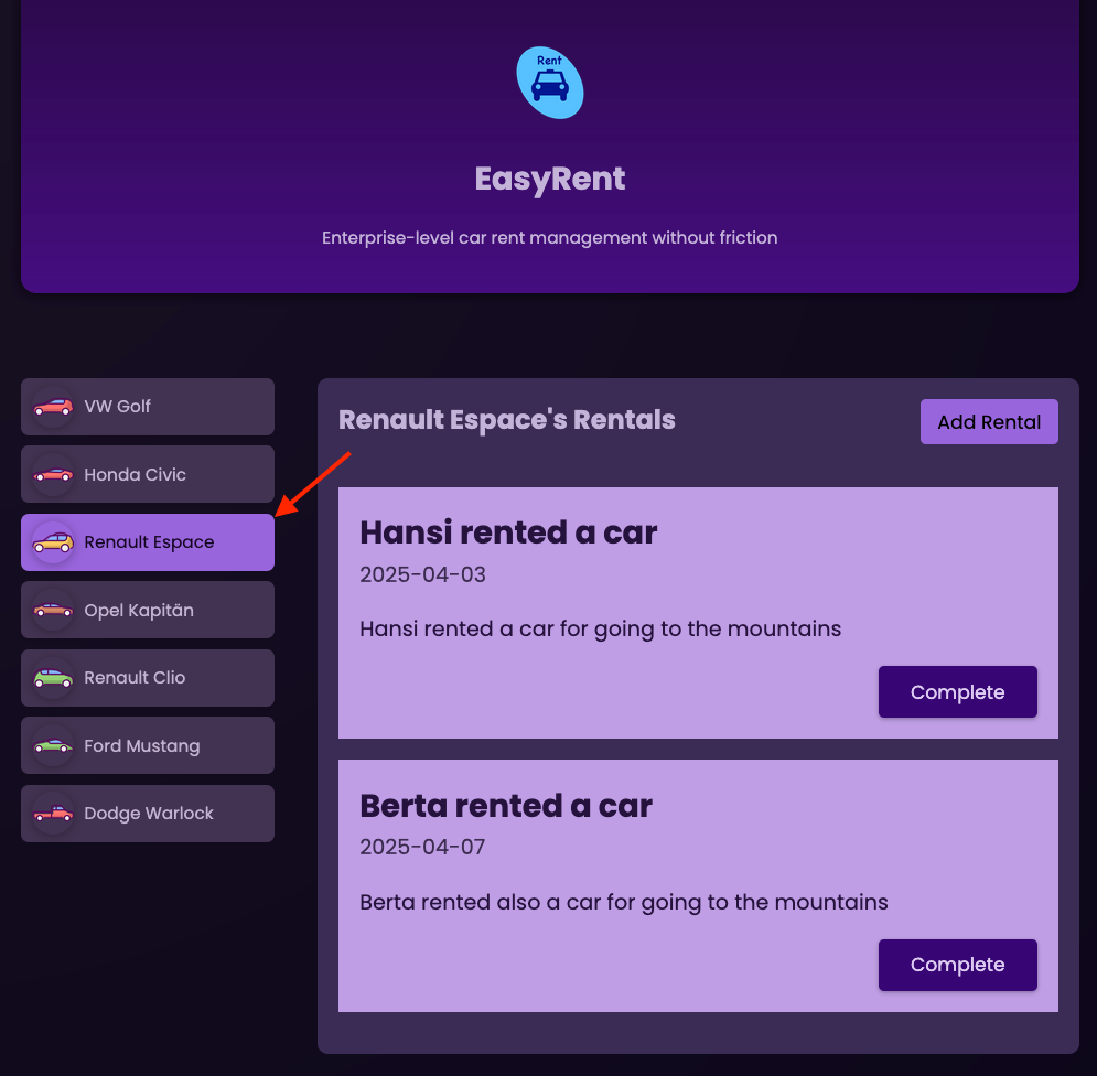
4.25. More Component Communication: Deleting Rentals
-
Now we want to delete a rental from the list of rentals.
-
For a vehicle we can have multiple rentals. The vehicles are booked by different users. When the user returns the vehicle, the rental is deleted.
-
Add a click-handler to the rental component.
-
<article>
<h2>{{rental.title}}</h2>
<time>{{rental.dueDate}}</time>
<p>{{rental.summary}}</p>
<p class="actions">
<button (click)="onCompleteRental()">Complete</button>
</p>
</article>-
Add an Output property to the rental component and a method to emit an event when the button is clicked.
import { Component, EventEmitter, Input, Output } from '@angular/core';
import { Rental } from './rental.model'
@Component({
selector: 'app-rental',
imports: [],
templateUrl: './rental.component.html',
styleUrl: './rental.component.css'
})
export class RentalComponent {
@Input({ required: true }) rental!: Rental
@Output() complete = new EventEmitter<string>()
onCompleteRental() {
this.complete.emit(this.rental.id)
}
}-
Now we catch the event and call the method
onCompleteRental($event).
<section id="rentals">
<header>
<h2>{{ brand }}'s Rentals</h2>
<menu>
<button>Add Rental</button>
</menu>
</header>
<ul>
@for (rental of selectedVehicleRentals; track rental.id) {
<li>
<app-rental [rental]="rental" (complete)="onCompleteRental($event)"/>
</li>
}
</ul>
</section>-
Finally, we implement the method
onCompleteRental()in the rentals component.
import { Component, Input } from '@angular/core';
import { RentalComponent } from './rental/rental.component';
@Component({
selector: 'app-rentals',
imports: [RentalComponent],
templateUrl: './rentals.component.html',
styleUrl: './rentals.component.css'
})
export class RentalsComponent {
@Input({ required: true }) vehicleId!: string
@Input({ required: true }) brand!: string
rentals = [
// ommitted for brevity
];
get selectedVehicleRentals() {
return this.rentals.filter((rental) => rental.vehicleId === this.vehicleId);
}
onCompleteRental(id: string) {
// ...
}
}-
The
onCompleteRental()method should remove the rental from the list of rentals. For this we can use thefilter()method.
onCompleteRental(id: string) {
this.rentals = this.rentals.filter((rental) => rental.id !== id);
}4.26. Creating and Conditionally Rendering Another Component
ng g c new-rental --skip-tests
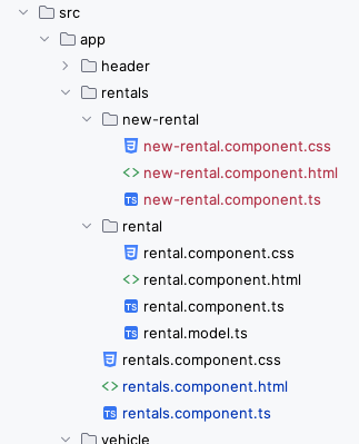
isAddingRental to the rentals component and a method to toggle the property.import { Component, Input } from '@angular/core';
import { RentalComponent } from './rental/rental.component';
import { NewRentalComponent } from './new-rental/new-rental.component';
@Component({
selector: 'app-rentals',
imports: [RentalComponent, NewRentalComponent],
templateUrl: './rentals.component.html',
styleUrl: './rentals.component.css'
})
export class RentalsComponent {
@Input({ required: true }) vehicleId!: string
@Input({ required: true }) brand!: string
isAddingRental = false;
rentals = [
{
id: 'r1',
vehicleId: 'v1',
title: 'Susi rented a car',
summary: 'Susi rented a car for going to the beach',
dueDate: '2025-04-01'
},
{
id: 'r2',
vehicleId: 'v3',
title: 'Hansi rented a car',
summary: 'Hansi rented a car for going to the mountains',
dueDate: '2025-04-03'
},
{
id: 'r3',
vehicleId: 'v3',
title: 'Berta rented a car',
summary: 'Berta rented also a car for going to the mountains',
dueDate: '2025-04-07'
},
];
get selectedVehicleRentals() {
return this.rentals.filter((rental) => rental.vehicleId === this.vehicleId);
}
onCompleteRental(id: string) {
this.rentals = this.rentals.filter((rental) => rental.id !== id);
}
onStartAddRental() {
this.isAddingRental = true;
}
}@if (isAddingRental) {
<app-new-rental />
}
<section id="rentals">
<header>
<h2>{{ brand }}'s Rentals</h2>
<menu>
<button (click)="onStartAddRental()">Add Rental</button>
</menu>
</header>
<ul>
@for (rental of selectedVehicleRentals; track rental.id) {
<li>
<app-rental [rental]="rental" (complete)="onCompleteRental($event)"/>
</li>
}
</ul>
</section>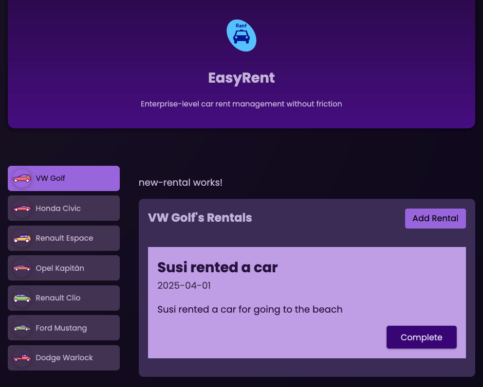
4.27. Managing the "New Rental" dialogue
html and css for the new-rental component
<div class="backdrop"></div>
<dialog open>
<h2>Add Rental</h2>
<form>
<p>
<label for="title">Title</label>
<input type="text" id="title" name="title" />
</p>
<p>
<label for="summary">Summary</label>
<textarea id="summary" rows="5" name="summary"></textarea>
</p>
<p>
<label for="due-date">Due Date</label>
<input type="date" id="due-date" name="due-date" />
</p>
<p class="actions">
<button type="button">Cancel</button>
<button type="submit">Create</button>
</p>
</form>
</dialog>.backdrop {
background-color: rgba(0, 0, 0, 0.9);
position: fixed;
top: 0;
left: 0;
width: 100%;
height: 100vh;
}
dialog {
width: 90%;
max-width: 30rem;
background-color: #433352;
border-radius: 6px;
border: none;
box-shadow: 0 1px 6px rgba(0, 0, 0, 0.4);
overflow: hidden;
padding: 1rem;
top: 5rem;
}
h2 {
margin: 0;
color: #d0c2e1;
}
label {
display: block;
font-weight: bold;
font-size: 0.85rem;
color: #ab9ac0;
}
input,
textarea {
width: 100%;
font: inherit;
padding: 0.15rem 0.25rem;
border-radius: 4px;
border: 1px solid #ab9ac0;
background-color: #d0c2e1;
}
.actions {
margin: 1rem 0 0;
display: flex;
justify-content: flex-end;
gap: 0.25rem;
}
button {
font: inherit;
cursor: pointer;
border: none;
padding: 0.35rem 1.25rem;
border-radius: 4px;
background-color: transparent;
}
button[type="button"] {
color: #bdadcf;
}
button[type="button"]:hover,
button[type="button"]:active {
color: #d0c2e1;
}
button[type="submit"] {
background-color: #9c73ca;
box-shadow: 0 1px 3px rgba(0, 0, 0, 0.3);
transition: all 0.3s ease;
}
button[type="submit"]:hover,
button[type="submit"]:active {
background-color: #895cce;
box-shadow: 0 1px 6px rgba(0, 0, 0, 0.3);
}
@media (min-width: 768px) {
dialog {
padding: 2rem;
}
}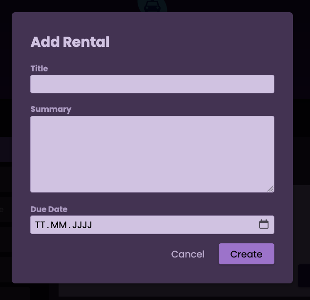
-
There is no functionality yet, but the dialog is displayed when the user clicks on the button "Add Rental".
4.27.1. Closing the "New Rental" dialogue
-
Either the user clicks on the button "Cancel" or the user clicks outside the dialog (the backdrop).
import { Component, EventEmitter, Output } from '@angular/core';
@Component({
selector: 'app-new-rental',
imports: [],
templateUrl: './new-rental.component.html',
styleUrl: './new-rental.component.css'
})
export class NewRentalComponent {
@Output() cancel = new EventEmitter<void>();
onCancel() {
this.cancel.emit();
}
}-
We add an output property to the new-rental component and a method to emit an event when the user clicks on the button "Cancel".
<div class="backdrop" (click)="onCancel()"></div>
<dialog open>
<h2>Add Rental</h2>
<form>
<p>
<label for="title">Title</label>
<input type="text" id="title" name="title" />
</p>
<p>
<label for="summary">Summary</label>
<textarea id="summary" rows="5" name="summary"></textarea>
</p>
<p>
<label for="due-date">Due Date</label>
<input type="date" id="due-date" name="due-date" />
</p>
<p class="actions">
<button type="button" (click)="onCancel()">Cancel</button>
<button type="submit">Create</button>
</p>
</form>
</dialog>-
Now we add a click-handler to the backdrop, so the user can also close the dialog by clicking outside the dialog.
-
We add a click-handler to the button "Cancel", so the user can close the dialog by clicking on the button "Cancel".
4.28. Using Directives & Two-Way-Binding
-
We can use the
ngModeldirective to bind the input fields to properties in the component. -
Directives are used to add behavior to an existing DOM element or component. They can be structural (like
ngForandngIf) or attribute directives (likengModel). -
Directives are similar to components, but they do not have their own view or template. Instead, they modify the behavior or appearance of an existing element.
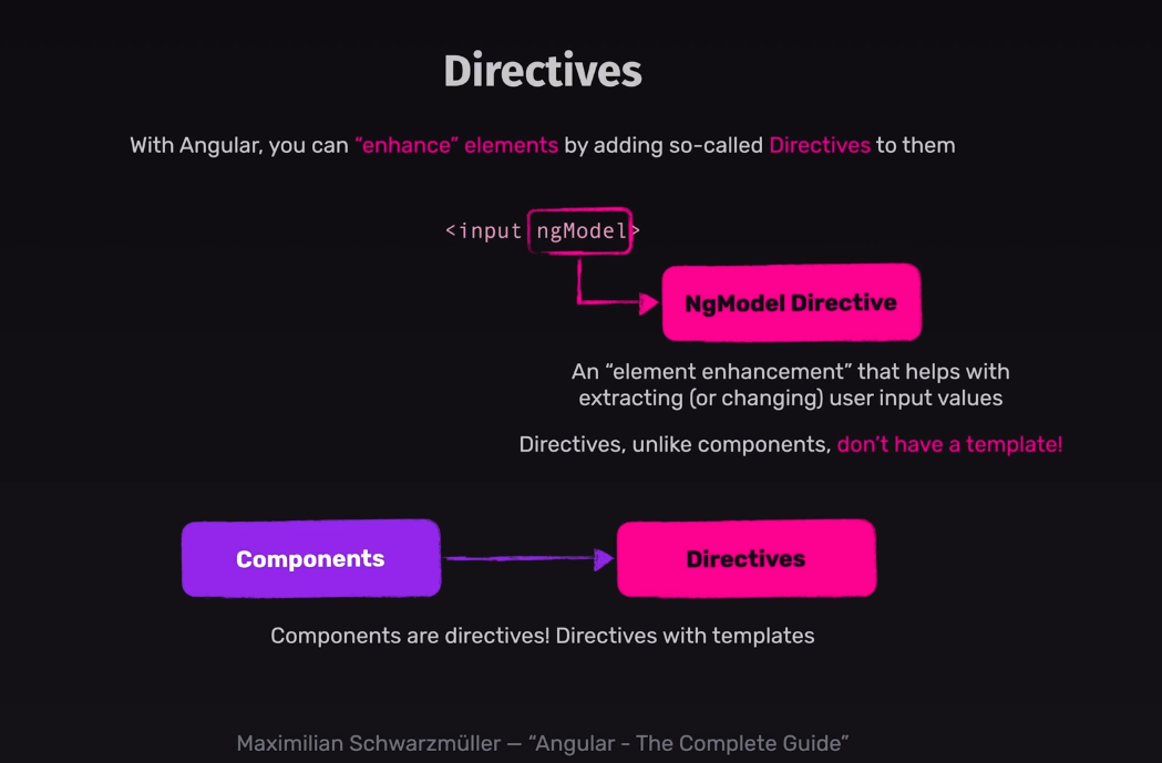
-
Now we can use the
ngModeldirective to bind the input fields to properties in the component. -
To show how it works, we add a new property "Title 2" to the
NewRentalComponentand bind the input fields to this property.
<div class="backdrop" (click)="onCancel()"></div>
<dialog open>
<h2>Add Rental</h2>
<form>
<p>
<label for="title">Title</label>
<input type="text" id="title" name="title" [(ngModel)]="enteredTitle" />
</p>
<p>
<label for="title2">Title 2</label>
<input type="text" id="title2" name="title2" [(ngModel)]="enteredTitle" />
</p>
<p>
<label for="summary">Summary</label>
<textarea id="summary" rows="5" name="summary"></textarea>
</p>
<p>
<label for="due-date">Due Date</label>
<input type="date" id="due-date" name="due-date" />
</p>
<p class="actions">
<button type="button" (click)="onCancel()">Cancel</button>
<button type="submit">Create</button>
</p>
</form>
</dialog>
4.29. Handling Form Submission
-
The form button would now try to send the form data to the server, but we don’t have a server yet.
-
so we have to deal with the data on the client-side.
-
In Angular this behaviour will be automatically, because we imported
FormsModuleto get thengModel.-
FormsModule includes a component which uses the standard form-element-tag as a selector and therefore takes control of this form.
-
This form component will automatically listen to the submit event and prevent the default behaviour of the form.
-
With
ngSubmitwe will get the submit event and can handle it in our component.
-
<div class="backdrop" (click)="onCancel()"></div>
<dialog open>
<h2>Add Rental</h2>
<form (ngSubmit)="onSubmit()">
<p>
<label for="title">Title</label>
<input type="text" id="title" name="title" [(ngModel)]="enteredTitle" />
</p>
<p>
<label for="summary">Summary</label>
<textarea id="summary" rows="5" name="summary" [(ngModel)]="enteredSummary"></textarea>
</p>
<p>
<label for="due-date">Due Date</label>
<input type="date" id="due-date" name="due-date" [(ngModel)]="enteredDate" />
</p>
<p class="actions">
<button type="button" (click)="onCancel()">Cancel</button>
<button type="submit">Create</button>
</p>
</form>
</dialog> 1
2
3
4
5
6
7
8
9
10
11
12
13
14
15
16
17
18
19
20
21
22
23
24
25
26
27
28
import { Component, EventEmitter, Output } from '@angular/core';
import { FormsModule } from '@angular/forms';
@Component({
selector: 'app-new-rental',
imports: [FormsModule],
templateUrl: './new-rental.component.html',
styleUrl: './new-rental.component.css'
})
export class NewRentalComponent {
@Output() cancel = new EventEmitter<void>()
@Output() add = new EventEmitter<{ title: string; summary: string; date: string }>()
enteredTitle = ''
enteredSummary = ''
enteredDate = ''
onCancel() {
this.cancel.emit()
}
onSubmit() {
this.add.emit({
title: this.enteredTitle,
summary: this.enteredSummary,
date: this.enteredDate,
})
}
}
-
rentals-component.ts soll nun den Event
addabfangen. -
The method would look like this:
onAddTask(rentalData: { title: string; summary: string; date: string }) {
// ...
}-
Wir führen für rentalData ein neues Interface ein, um die Daten zu typisieren.:
export interface Rental {
id: string
vehicleId: string
title: string
summary: string
dueDate: string
}
export interface NewRentalData {
title: string
summary: string
date: string
}
-
You could create a separate file
new-rental-model.ts, but we will userental-model.ts. -
The files should now look like:
<div class="backdrop" (click)="onCancel()"></div>
<dialog open>
<h2>Add Rental</h2>
<form (ngSubmit)="onSubmit()">
<p>
<label for="title">Title</label>
<input type="text" id="title" name="title" [(ngModel)]="enteredTitle" />
</p>
<p>
<label for="summary">Summary</label>
<textarea id="summary" rows="5" name="summary" [(ngModel)]="enteredSummary"></textarea>
</p>
<p>
<label for="due-date">Due Date</label>
<input type="date" id="due-date" name="due-date" [(ngModel)]="enteredDate" />
</p>
<p class="actions">
<button type="button" (click)="onCancel()">Cancel</button>
<button type="submit">Create</button>
</p>
</form>
</dialog>import { Component, EventEmitter, Output } from '@angular/core';
import { FormsModule } from '@angular/forms';
import { type NewRentalData } from '../rental/rental.model';
@Component({
selector: 'app-new-rental',
imports: [FormsModule],
templateUrl: './new-rental.component.html',
styleUrl: './new-rental.component.css'
})
export class NewRentalComponent {
@Output() cancel = new EventEmitter<void>()
@Output() add = new EventEmitter<NewRentalData>()
enteredTitle = ''
enteredSummary = ''
enteredDate = ''
onCancel() {
this.cancel.emit()
}
onSubmit() {
this.add.emit({
title: this.enteredTitle,
summary: this.enteredSummary,
date: this.enteredDate,
})
}
}@if (isAddingRental) {
<app-new-rental
(cancel)="onCancelAddTask()"
(add)="onAddTask($event)"
/>
}
<section id="rentals">
<header>
<h2>{{ brand }}'s Rentals</h2>
<menu>
<button (click)="onStartAddRental()">Add Rental</button>
</menu>
</header>
<ul>
@for (rental of selectedVehicleRentals; track rental.id) {
<li>
<app-rental [rental]="rental" (complete)="onCompleteRental($event)"/>
</li>
}
</ul>
</section> 1
2
3
4
5
6
7
8
9
10
11
12
13
14
15
16
17
18
19
20
21
22
23
24
25
26
27
28
29
30
31
32
33
34
35
36
37
38
39
40
41
42
43
44
45
46
47
48
49
50
51
52
53
54
55
56
57
58
59
60
61
62
63
64
65
66
67
import { Component, Input } from '@angular/core';
import { RentalComponent } from './rental/rental.component';
import { NewRentalComponent } from './new-rental/new-rental.component';
import { type NewRentalData } from './rental/rental.model';
@Component({
selector: 'app-rentals',
imports: [RentalComponent, NewRentalComponent],
templateUrl: './rentals.component.html',
styleUrl: './rentals.component.css'
})
export class RentalsComponent {
@Input({ required: true }) vehicleId!: string
@Input({ required: true }) brand!: string
isAddingRental = false;
rentals = [
{
id: 'r1',
vehicleId: 'v1',
title: 'Susi rented a car',
summary: 'Susi rented a car for going to the beach',
dueDate: '2025-04-01'
},
{
id: 'r2',
vehicleId: 'v3',
title: 'Hansi rented a car',
summary: 'Hansi rented a car for going to the mountains',
dueDate: '2025-04-03'
},
{
id: 'r3',
vehicleId: 'v3',
title: 'Berta rented a car',
summary: 'Berta rented also a car for going to the mountains',
dueDate: '2025-04-07'
},
];
get selectedVehicleRentals() {
return this.rentals.filter((rental) => rental.vehicleId === this.vehicleId)
}
onCompleteRental(id: string) {
this.rentals = this.rentals.filter((rental) => rental.id !== id)
}
onStartAddRental() {
this.isAddingRental = true
}
onCancelAddTask() {
this.isAddingRental = false
}
onAddTask(rentalData: NewRentalData) {
this.rentals.unshift({
id: new Date().getTime().toString(),
vehicleId: this.vehicleId,
title: rentalData.title,
summary: rentalData.summary,
dueDate: rentalData.date
})
this.isAddingRental = false
}
}
-
At line 4 we use type for better performance when compiling and for getting no problems with circular dependencies.
-
at line 58 we could use
pushfor adding the new rental at the end of the list, but we want to add the new rental at the beginning of the list, so we useunshift. -
Now you can try the result
4.30. Content Projection with ngContent
-
To get rounded corners when displaying rentals you could use the
ng-containerdirective.
ng g c shared/card --skip-testsNode.js version v23.11.0 detected. CREATE src/app/shared/card/card.component.css (0 bytes) CREATE src/app/shared/card/card.component.html (19 bytes) CREATE src/app/shared/card/card.component.ts (206 bytes)
-
CUT from vehicle.component.css this style and add it to the card.component.css
div {
border-radius: 6px;
box-shadow: 0 1px 6px rgba(0, 0, 0, 0.1);
overflow: hidden;
}<app-card>
<div>
  <button [class.active]="selected"
          (click)="onSelectVehicle()">
    <img
      [src]="imagePath"
      [alt]="vehicle.brand"
    />
    <span>{{ vehicle.brand }}</span>
  </button>
</div>
</app-card>
-
You have to import the
CardComponent(app-card) into thevehicle-component.ts.
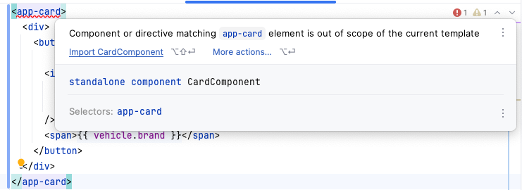
<div>
  <ng-content />
</div>
We are using here the directive <ng-content> in the card.component.html. The <ng-content>-directive is a placeholder for the content that will be projected into the card component.
|
<app-card>
  <article>
    <h2>{{ rental.title }}</h2>
    <time>{{ rental.dueDate }}</time>
    <p>{{ rental.summary }}</p>
    <p class="actions">
      <button (click)="onCompleteRental()">Complete</button>
    </p>
  </article>
</app-card>
to import the CardComponent (app-card) into the rental-component.ts.
|
-
Now are the rentals inside the vehicles also provided with rounded corners.
4.31. Transforming Template Data with Pipes
-
At the moment the dueDate in rental.component.html is displayed in the format
YYYY-MM-DD. We want to display it in the formatDD.MM.YYYY.
<app-card>
    ...
    <time>{{ rental.dueDate }}</time>
    ...
</app-card>
is rendered to
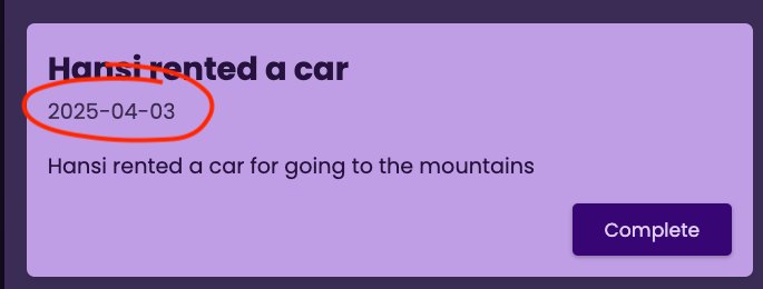
-
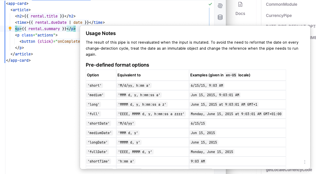
We can use the
datepipe to format the date. -
The date pipe is a built-in Angular pipe that formats a date value according to locale rules. It can be used to format dates in various ways, such as displaying the date in a specific format or converting it to a different time zone.
<app-card>
  <article>
    <h2>{{ rental.title }}</h2>
    <time>{{ rental.dueDate | date }}</time>
    <p>{{ rental.summary }}</p>
    <p class="actions">
      <button (click)="onCompleteRental()">Complete</button>
    </p>
  </article>
</app-card>
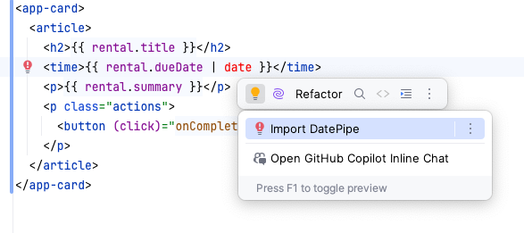
Don’t forget to import the date-pipe into the rental-component.ts.
|
-
It is possible to customize the date
4.32. Getting Started with Services
-
Now we have to solve some structural problems. It is not a good idea to have the data in the rentals-component. We should use a service to manage the data.
-
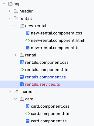
First we create a file
rentals.service.tsin therentalsfolder.
-
Then we move code from rentals.component.ts to the service rentals.service.ts.
import { type NewRentalData } from './rental/rental.model';

class RentalsService {

  private rentals = [
    {
      id: 'r1',
      vehicleId: 'v1',
      title: 'Susi rented a car',
      summary: 'Susi rented a car for going to the beach',
      dueDate: '2025-04-01'
    },
    {
      id: 'r2',
      vehicleId: 'v3',
      title: 'Hansi rented a car',
      summary: 'Hansi rented a car for going to the mountains',
      dueDate: '2025-04-03'
    },
    {
      id: 'r3',
      vehicleId: 'v3',
      title: 'Berta rented a car',
      summary: 'Berta rented also a car for going to the mountains',
      dueDate: '2025-04-07'
    },
  ];

  getVehicleRentals(vehicleId: string) {
    return this.rentals.filter(
      (rental) => rental.vehicleId === vehicleId
    )
  }

  addRental(rentalData: NewRentalData, vehicleId: string) {
    this.rentals.unshift({
      id: new Date().getTime().toString(),
      vehicleId: vehicleId,
      title: rentalData.title,
      summary: rentalData.summary,
      dueDate: rentalData.date
    })
  }

  removeRental(rentalId: string) {
    this.rentals = this.rentals.filter((rental) => rental.id !== rentalId)
  }
}import { Component, Input } from '@angular/core';
import { RentalComponent } from './rental/rental.component';
import { NewRentalComponent } from './new-rental/new-rental.component';
import { type NewRentalData } from './rental/rental.model';
@Component({
selector: 'app-rentals',
imports: [RentalComponent, NewRentalComponent],
templateUrl: './rentals.component.html',
styleUrl: './rentals.component.css'
})
export class RentalsComponent {
@Input({ required: true }) vehicleId!: string
@Input({ required: true }) brand!: string
isAddingRental = false;
get selectedVehicleRentals() {
return
}
onCompleteRental(id: string) {
}
onStartAddRental() {
this.isAddingRental = true
}
onCancelAddTask() {
this.isAddingRental = false
}
onAddTask(rentalData: NewRentalData) {
this.isAddingRental = false
}
}-
At the moment the app is NOT working, because we have to inject the service into the component.
4.33. Getting Started with Dependency Injection
-
First we export the service-class in the
rentals.service.tsfile.
import { type NewRentalData } from './rental/rental.model';
import { Injectable } from '@angular/core';

@Injectable({ providedIn: 'root' })
export class RentalsService {

    // ommitted for brevity

}import { Component, Input } from '@angular/core';
import { RentalComponent } from './rental/rental.component';
import { NewRentalComponent } from './new-rental/new-rental.component';
import { type NewRentalData } from './rental/rental.model';
import { RentalsService } from './rentals.services';
@Component({
selector: 'app-rentals',
imports: [RentalComponent, NewRentalComponent],
templateUrl: './rentals.component.html',
styleUrl: './rentals.component.css'
})
export class RentalsComponent {
@Input({ required: true }) vehicleId!: string
@Input({ required: true }) brand!: string
isAddingRental = false
// private stores the rentalsService automatically in a local Property
constructor(private rentalsService: RentalsService) {}
get selectedVehicleRentals() {
return this.rentalsService.getVehicleRentals(this.vehicleId)
}
onCompleteRental(id: string) {
}
onStartAddRental() {
this.isAddingRental = true
}
onCancelAddTask() {
this.isAddingRental = false
}
onAddTask(rentalData: NewRentalData) {
this.isAddingRental = false
}
}